The Timeless Strength Behind The Addison’s Brand
When it comes to creating a visual identity that stands tall, steady, and unmistakably confident, The Addison Physiotherapy & Sports Injury Clinic leans on a typeface that embodies all of those traits — Rockwell.

A Typeface with Backbone
Rockwell isn’t just a font. It’s a statement.
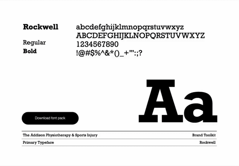
With its sturdy slab serifs, geometric balance, and no-nonsense presence, Rockwell has long been the go-to for brands that want to convey trust, dependability, and heritage — while still feeling modern and grounded. For The Addison, it’s the perfect typographic expression of strength and support — qualities central to both the clinic’s philosophy and its patient care.
Whether used in its Regular form for body copy or Bold for emphasis, Rockwell carries a sense of structure — like the human frame itself. It’s a typeface that feels engineered yet human, a rare balance that mirrors The Addison’s approach to recovery: science-backed care delivered with a personal touch.
A Mark That Moves With You
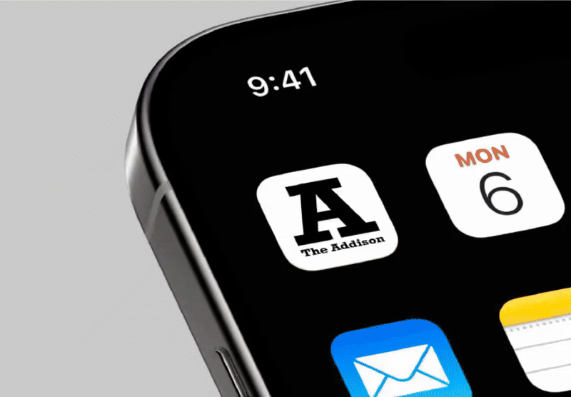
The Addison’s bold “A” icon sits proudly at the heart of the brand — a powerful visual shorthand that’s instantly recognizable whether on print, signage, or digital screens. When that same monogram sits on your home screen, it feels like more than an app. It’s a reminder: progress is possible, and support is just a tap away.
Much like the Rockwell “A” it’s inspired by, the icon feels solid and dependable — a foundation you can trust. Paired with clean white space and confident typography, the brand moves effortlessly between tradition and technology.
Design That Heals Through Simplicity
The Addison’s design system strips away the unnecessary, allowing typography and form to do the heavy lifting. There’s no clutter — just clarity. The typography is the design. It creates a rhythm, a pulse, a structure that supports every communication with confidence and calm.
This is branding as therapy — measured, intentional, and grounded.
Why It Works
Rockwell’s timeless geometry, combined with The Addison’s minimal design language, creates a feeling of steadiness that patients intuitively trust. In a field where clarity and confidence are everything, every letter matters — and Rockwell delivers both form and function in perfect alignment.